
An Intuitive Guide to Interface Design
A guide to creating web-sites and interfaces people will love using.

I see loads of bad interfaces out there – and with the current AI wave making developer jobs even easier – what amazes me is that nothing is getting better. This is why I’m writing this guide – it’s a collection of design and usability principles that I’ve collected over the 20+ years of my software development journey. Hopefully you find them useful.
Simplicity
This is achieved when everyone can understand the design, regardless of experience or literacy. Some of the keys that aid simplicity are provided below:
Remove unnecessary complexity.
Focus on the 20%: the 80-20 rule states that 80% of the effects generated by any large system are caused by 20 percent of the variables in that system. To implement great software, focus on making the key 20% of the features 1) easy to discover and 2) easy to use. Also – avoid including non-critical functions in the software.
Use progressive disclosure to present only relevant information and controls to the user.
Provide clear prompting and feedback for actions.
Keep textual information (wording) simple.
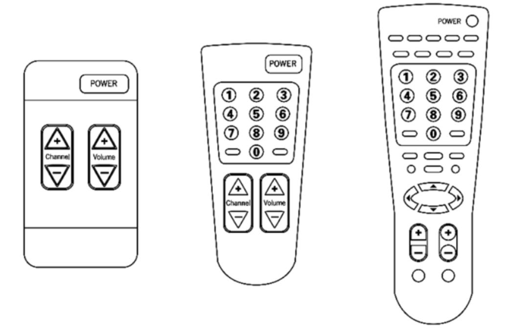
Flexibility-usability trade-off: flexibility allows you to do more things at the expense of complexity. Favor simplicity here: make designs easy to use and focus on the key feature set, but also do not over simplify. Hiding functionality to create the illusion of simplicity is a bad approach, so a fine-balance must be struck. In the below example, the middle remote-control is what we want.
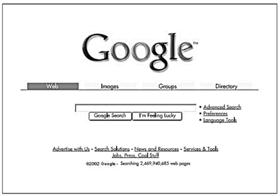
Another great example of simplicity perfected is Google (especially in its early days):


Don’t Make Me Think
The number one usability principles for any website or interface: do not make me think!!
As a software designer (or developer), your job is to get rid of any questions marks your software produces.
Things that make us think:
Obscure names: make sure that the names of your links are clear.
Links and buttons that are not obviously click-able.
Searches: make it easy for users to search for what they are looking for.
Where am I: should be present on top of the page (via tags and titles).
Make it easy for users to get back to what they were doing: i.e. if a user starts going through a wizard or provides inputs to forms, they should be able to log off and log back on to continue what they were doing. All data or stored information about the user should be stored safely (i.e. encrypted at REST). Avoid having users re-enter data: there is no greater source of frustration.
Visibility
If the user cannot see it, it does not exist.
Make the tasks the users want to perform easy to discover and present on the interface.
Advanced and less-used controls and features should easily be easy to discover (through progressive disclosure or sub-menus) but should not be displayed if they are not used often by your user base.
Include a search bar near the top of the page (it allows most users to find what they are looking for quickly).
Place controls which anticipate user needs prominently and consistently on the display.
Perceptibility
Perceptibility refers to whether everyone (i.e. regular users, seniors, people with disabilities) can perceive your design. Basic guidelines to making your design perceptible are provided below:
Make sure there is good contrast between text and background for readability.
Pick clean, legible fonts.
Present information using redundant coding methods (i.e. textual, iconic, and tactile). Most modern designs fail here since they’ll opt to include the key textual information and opt with presenting an icon instead – do not do this. A great design will opt to use both. This will aid different users in finding the features that your solution is attempting to provide.
Avoid visual noise: keep the user options simple and avoid providing too many options.
If you are using images or icons, make sure that they are not just familiar to you: make sure that they match your user mental model as well and focus on making the elements you select shared and clear among the target user base.
Follow real-world conventions: when a designs controls match real-world conventions and corresponding to desired outcomes, the design is easier to learn and remember. As an example, an article Title will always be positioned on top of the page while the comments will usually be available on the bottom – use conventions and position your controls and info according to established standards.

Point of Entry (Home Page Design)
A home page needs to answer 4 basic questions:
What is this?
What can I do here?
What do they have here?
Why should I be here, and not somewhere else?
A user should be able to answer these questions at a glance, correctly and unambiguously, with very little effort.
How to get the message across: There are 2 important places on the page where we expect to find explicit statements of what the site is about:
The tagline. Right next to the site ID.
The Welcome blurb. The Welcome blurb is a terse description of the site, displayed in a prominent block on the home page that's visible without scrolling.
Nothing beats a great tagline. A tagline is a small phrase that summarizes what the site is and what makes it great. It appears right below, above, or next to the site ID.
Good taglines are clear and informative (avoid vagueness and ambiguity).
Good tag lines are just long enough. 6 to 8 words seem good enough to convey a thought.
Good taglines convey differentiation and a clear benefit.
Good taglines are personable, lively, and sometimes clever.
When a user enters a new site, they should be able to say with confidence:
Here's where I start if I want to search (i.e. include a search bar).
Here's where I start if I want to browse (i.e. include a menu that allows the user to view the key pages and content provided within the website).
Here's where I start if I want to sample their best stuff.
Language
The design should speak the users language.
Use words, phrases, and concepts familiar to the user, rather than jargon.
Omit needless words and punctuation. Most of the words on a web-page are just taking up unnecessary space. Nobody is going to read them. Get rid of half the words. And then get rid of the other half. Be careful not to sacrifice clarity though.
Eliminate all happy talk, which is that part of the site that tells the user how great it is. Let the functionality speak for itself.
Generally, use an active voice rather than passive – (i.e. prefer the subject performs the action rather than the subject receives the action). Examples:
Good (active): The researcher analyzed the data.
Bad (passive): The data was analyzed by the researcher.
Express complex material in the simplest way possible.
The other source of needless words is instructions. Nobody is going to read them, at least not until their first attempts at muddling through have failed. Make everything self-explanatory, so the users won't need instructions.
Text
Text should have high contrast (prefer black text with a white background).
Favor readability over prettiness (use large, simple, and aliased fonts).
Favor particularly large characters for the actual data you intend to display, as opposed to labels and instructions. For example, the label, “Last Name,” can afford to be somewhat small. The actual last name entered/displayed, however, must be clearly readable. This becomes even more important for numbers.
Menu and button labels should have the key word(s) first, forming unique labels.
There’s often an inverse relationship between the “prettiness” of a font and its readability. Specifically, anti-aliasing softens the edges of a font, giving it a much smoother appearance on the digital page. The problem is that the human vision system responds to sharp edges, so, in smaller font sizes, an anti-aliased font, while often appearing more attractive, can be quite difficult to comprehend.
Use Framing Wisely: your wording will influence the way a user behaves and what options they choose – so frame your wording wisely. Use positive frames (i.e. present information in a positive manner) if you want to nudge the user into taking action. Use negative frames when you want to promote the opposite.
Use Priming Wisely: every word you use on the page has influence and automatically primes your users’ memory – so choose your words wisely. As an example, in a study – 2 groups of students were primed with 2 different sets of words: one was primed with politeness and the other group was primed with rudeness. At the end of the test, the group primed with polite words had a much lower probability of interrupting the study administrator (17%) than the group who was primed with rudeness (63%).
Visual Hierarchy
The appearance of the things of the page, all of the visual cues, must clearly and accurately portray the relationships between the things on the page.
Align elements on a grid to keep everything organized.
Break pages up into clearly defined areas.
Page names: every page needs a name. The name should be prominent and present on top of each page.
Group related items together and separate unrelated ones with spacing.
If something is more important, make it larger. Use large objects for important functions and small objects for functions you would prefer users not to perform.
Primary buttons or headlines might be larger and brighter than secondary text.
Things should be “nested” visually to show what's part of what.
By guiding users with clear headings, highlighted buttons, and logical grouping, the interface becomes much easier to scan and navigate.
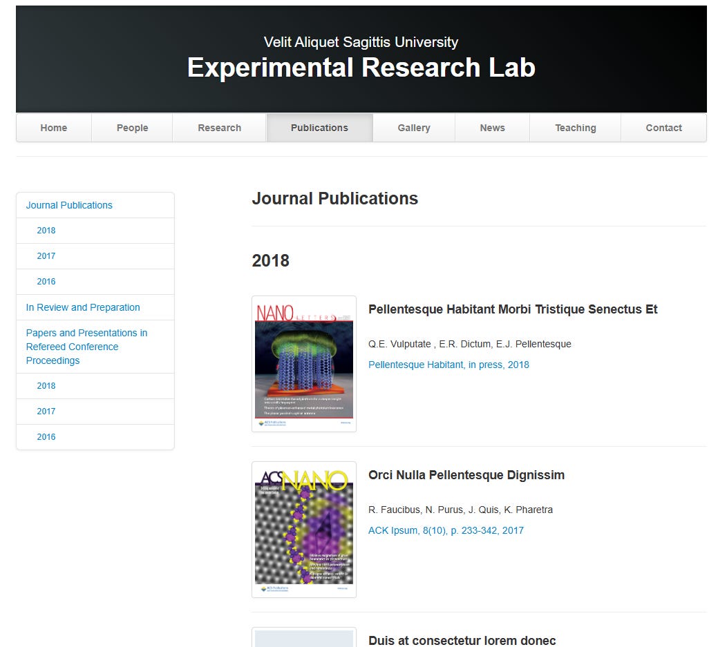
Navigation
Include persistent navigation present on top of the page with local navigation (present vertically and on the left) of the page. Here is an example which shows this – the website allows users to navigate through main web-site content (top-level menu) as well as the general page content which is easily viable on the left:

Consistency
Systems are more usable and learnable when similar parts are expressed in similar ways. Stick to a unified color palette, font family, and icon set. Repeating the same colors and typography across your interface builds familiarity and trust.
If existing software systems exist with a similar set of features you are looking to implement (and that other users love using) – come up with a design that mimics the functionality rather than suffering from the not invented here syndrome.
Consistency enables people to efficiently transfer knowledge to new contexts, learn new things quickly, and focus attention to the task they are looking to accomplish.
Keep the style and appearance of your application (i.e. logos, icons, wording, menus) consistent across screens.
Maximize User Efficiency
People cost a lot more money than machines. Do not keep users waiting.
Make it easy for them to do what they want to do rather than asking them to adopt to enforced standards & formats.
As a single example, forcing customers to enter telephone numbers without normal spacing or punctuation saves a single line of code and a handful of machine cycles. It also results in a lot of incorrectly captured phone numbers. (That’s exactly why phone numbers are broken up into smaller pieces.)
When possible, format data correctly using automatic methodologies. When not possible, force the users to enter the data in the correct format (think of how much time users waste in finding phone numbers stored in different formats across your system. Do not sacrifice the future for today).
Minimize Cognitive Load
Cognitive load is the amount of mental activity (perception, memory, and problem solving) required to accomplish a goal. As an example, early computer systems required users to remember large sets of commands which they needed to type in specific ways to execute their tasks. The advent of graphical user interfaces that allowed them to browse rather than remember information increased computer adoption by a large factor.
Eliminate unnecessary information from displays.
Chunk information to be remembered.
Provide memory aids to assist with remembering tasks.
Reduce the amount of steps needed in order to accomplish a task or completely look to automate any complex or memory intensive tasks all together.
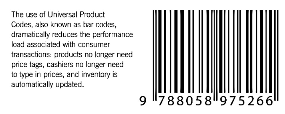
Overall, always look to help the user by making their job easier and simplifying the tasks they have to perform. One great example of this is the use of UPC code and bar-codes in the modern world.
Anticipation (and Recognition Rather than Recall)
Bring to the user all the information and tools needed to perform each step of the process:
Your interface needs to anticipate the user needs and wants. Do not expect users to leave the current screen to search for the necessary information: all the information he or she needs should be in place and should be visible.
Understand the task domain and the user domain so that you can understand the information that is needed in order to create the solution.
Make the tool or information present on the screen where users can easily find it.
Do not ask users to remember information from one part of the interface to another. Information that is needed should be easily retrievable within the interface.
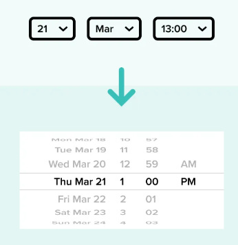
Provide easy to use auto-completion text boxes and select boxes that limit the burden on users. Avoid having users manually entering information when you can provide assistance to them through easy to use controls.
Maximize Signal-to-Noise
Simplify the presentation and remove and unnecessary elements to maximize the signal-to-noise ratio. The below shows some examples of data presented where removing information from the image results in a better visual presentation (image on the right):
Create Aesthetic Interfaces
Aesthetic designs are perceived as easier to use than less aesthetic designs so:
Aesthetic designs look easier to use and have a higher probability of being used, whether or not they actually are easier to use – so make your interfaces look beautiful.
Embrace whitespace (maximize simplicity). Less is more. Remove any non-essential elements and give important items room to breathe. Proper whitespace greatly improves clarity.
Embrace minimalism: A clean, minimalist layout (think Google’s homepage or Apple’s style) will feel fast and intuitive to users.
Polished look: consistent colors, crisp icons, balanced spacing – makes the product feel more engaging and trustworthy.
Create a clear visual hierarchy: Lead the user’s eye by making key elements stand out with size, contrast, or color.
Proper line spacing and margins in your text also add to a polished, easy-on-the-eyes design.
Use colors conservatively. Limit the palette to what the eye can process at once glance (about 5 colors depending on the complexity of the design).
Achieve aesthetic color combinations by using adjacent colors on the color wheel.
Use warmer colors for foreground elements and cooler colors for background elements.
Prefer Most Advanced Yet Acceptable: aesthetic appeal is a balancing act between 2 variables: familiarity and uniqueness. You need to balance those 2 in order to find commercial success. According to research, the MAYA principle states that the best design is something that is recognizable as familiar while also being novel and unique is the best formula for success (i.e. software adoption). Make the design easy to use and recognize while adding some novelty in order to make it stand out from the competition.
Contours
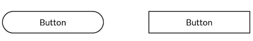
Prefer rounded contours or corners in your interfaces. In experiments where subjects were presented with otherwise similar angled vs contoured objects, subjects strongly preferred more rounded, contoured objects.
Use angular and pointy features to attract attention and provoke thought: in other words, any alerts or confirmations or system notifications which alerts users to urgent issues or which may require more deep thinking should have sharp angles. Studies show that fear-processing centers and associative memory segments of the brain are activated more using sharp edges than rounded corners. The degree of the angularity is correlated with the strength of amygdala (fear processing activation) so sharper edges evoke more attention.
To sum it up: use rounded corners for most interfaces (that provide a regular flow and do not need special attention) – reserve sharp edges for things that do need attention (like warnings or critical alerts).
Control
Visibility of system status: the page should always keep users informed about what is going on, through appropriate feedback and in a reasonable amount of time. The user needs to be in control. Predictable interactions create trust in the product and brand.
Present feedback to the user as quickly as possible (ideally immediately).
Build trust through open and continuous communication.
There are two target users for every piece of software: beginning users (which the design should be focused on accommodating) and advanced users (which the design should also make room for).
Avoid adding too many advanced features for users who want to have shortcuts: focus in on being accommodating to these users without cluttering the interface and provide key-board shortcuts for them to execute actions more quickly.
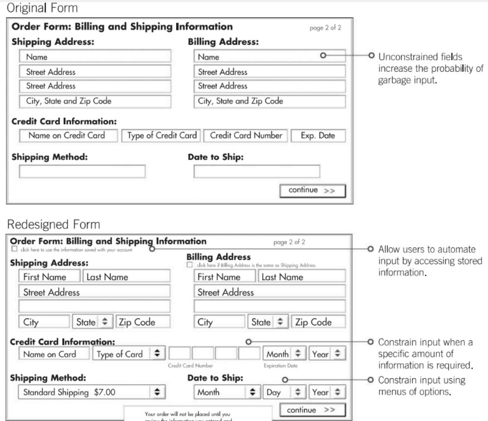
Input Validation
Validate all user inputs (i.e. garbage in – garbage out dictates that we want to avoid garbage data within our systems).
Make it hard for users to enter bad or invalid data (i.e. do data validation for all inputs).
Use constraints to help users input valid data.
Format data according to a consistent standard prior to storing it within the data layer (i.e. keep the data consistent).
Avoid free form fields which may contain multiple data elements.
Keep the data consistent (i.e. formatted in the same way within your data layer).


Error Messages
Error messages must be written to show:
Explain what is wrong.
Tell the user what to do about it.
Avoid displaying system errors or exceptions within error messages (i.e. like error 4421). Provide information which is simply worded and which displays the 2 main things we outlined above.
Forgiveness
Minimize the consequences and occurrences of errors by:
Using constraints (to limit user input such that only valid data can be used).
Using confirmations and warnings to reduce the occurrences of errors.
Using confirmations only on non-reversible and serious actions (since they slow task performance) – if an action is reversible, avoid presenting confirmation dialogs or messages. Also – they should be used sparingly: people do not like continually being interrupted.
For non-critical confirmations, a select box which allows the user to turn them off should be available.
Include reversible actions and safety nets to minimize the consequence of errors (i.e. include undo and redo as a possible action).
Show a clear way to exist the current interaction by including a Cancel button.
Cancel is particularly important in Wizards. Let people leave at any time and make sure to tell them where they can finish the task later on.
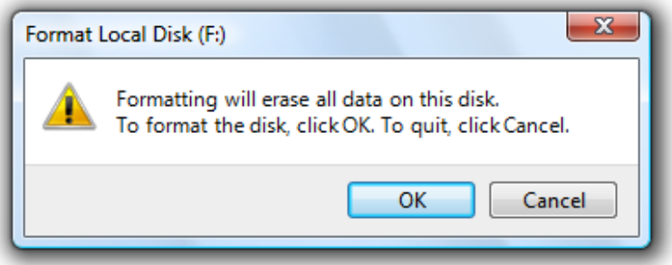
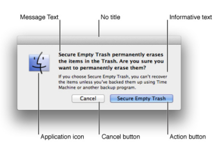
Dialog Design
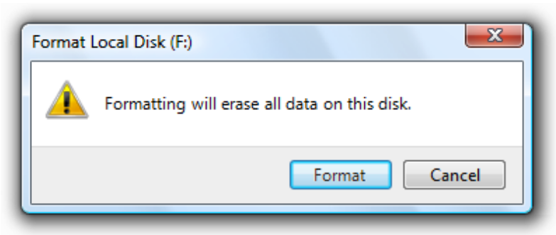
Nobody reads your dialog boxes. Use a verb whenever possible instead of 'Yes' or 'OK' because your buttons will make sense out of context with the explanatory text or title.
Bad Example (in the example below, there is a chance the users will not read what they are confirming):
Great Example (you can be sure that at least users understand that they are about to format a disk):

Apple's Human Interface Guidelines expand on this even further, recommending multi-word verbs instead of "OK" or "Yes" buttons, and clearly defining the suggested regions for an alert box:

Ensure that the default button name corresponds to the action you describe. In particular, it’s a good idea to avoid using OK for the default button.
Also note that, given a choice between 'No' and 'Cancel', 'Cancel' is almost always better for exactly the same reasons as above: the meaning of 'Cancel' is clear even if the user hasn't read the rest of the dialog box.

Defaults
Defaults within fields should be easy to remove (i.e. when a user activates a field, the current entry should be auto-selected so that pressing backspace or delete will eliminate the current entry).
Not everything should have a default: if there isn’t one winner, consider offering no default.
For defaults that do not have a clear winner and that should be set: choose the default which does the least harm and delivers the most good (i.e. enroll employees into a pension plan to promote savings, or choose to automatically opt-in people for organ donations as an example).
The default word: avoid using it. If you want the user to revert to standard settings for example, create a button which shows the text ‘revert to standard settings’, ‘use customary settings’, or ‘restore initial settings’. Use terminology which describes what will happen rather than generic terms.
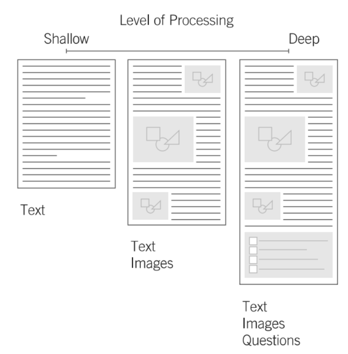
Depth of Processing
The key determining factors of how deeply information is processed:
Distinctiveness of the information (uniqueness of the info with respect to previous experience).
Relevance of the information (how important is the information).
Degree of elaboration (how much thought is required to interpret the information).
Use a unique presentation and interesting activities to engage people to deeply process information and to aid in learning. The more deeply learners process information, the better they learn.
People remember pictures better than words (especially when forming memories) – so use both to aid recall.
Present important items at the beginning or end of a list (rather than the middle) to aid recall. When a list is visual, present important items at the beginning of the list. If the list is auditory, present important items at the end.
User Testing
If you want a great site, you've got to test. Testing reminds you that not everybody thinks the way you do, knows what you do, and uses the web the way you do.
Testing one user is 100% better than testing none. Even the worst test with the wrong user can show you how you can improve your site.
How many users should you test? Usually, the ideal number for each round of testing is 3-4. The first 3 users are very likely to encounter all the most significant problems.
Testing one user early in the project is better than testing 50 near the end. Don't make a big deal out of testing. Do it early and often. Users don't like changes in the system, so it's better to test them early than doing it later and having to change things.
If users find the interface confusing or slow, simplify it.
The importance of recruiting representative users is overrated.
Testing is an iterative process. Testing isn't something you do once. You make something, test it, fix it, and test it again. It's also important that once you fix these problems, you do more rounds of testing, where the users will encounter other problems with your site. It's better to focus on the biggest problems, fix them, and then do further testing.
Key Questions When Starting a Design
If you are designing a new concept or interface, or just getting started on a design project, some great questions to ask prior to doing any design work are shown below:
What are your goals and objectives?
What are your top priorities?
How do you know if you are successful?
Do you measure success and if so – how do you define it?
Who do you consider to be your primary customer?
What are their priorities and goals?
Why do they use your products?
What prevents them from using your products, if anything?
What questions do you have about your users which you do not have answers to?
Who are your competitors, and how well are you doing compared to them?
What do you do well?
What could be improved?
What differentiates you and your company and your product in the market?
The key point here is to try to find the root-cause of the problem that they are trying to solve, as well as to design something which differentiates them from the existing competition. The Y-Combinator Principle is that creating a product that a small group of users LOVE is much better than designing a product that meets the needs of all users but that most users like. Also, focus on creating something that a market-segment loves and something which is different from what is already available (i.e. blue ocean market).
This ends the first part of my design series. If you enjoyed this content - leave a message or subscribe.
Credits and References
Most of the images available within the blog post were taken from the book Universal Principles of Design referenced below.
Last but not least, many thanks to the paid subscribers of this Substack!! This is an ad-free publication and your help means the world to me. By subscribing, you receive early access to my content, as well as priority when it comes to any future topics which you want me to cover. Thank you for reading and have a great one!